My role
I was the only designer on Escurify, working through my agency, Branym Technologies. I owned research synthesis, information architecture, user flows, UI design, and prototyping: every screen in the product. Two Branym developers build the MVP; the founder, Ayush Chandhok, owns the business, and part of my job was arguing with it. I started in March 2026 and design ahead of the build.
Introduction
Escurify holds a buyer's money in escrow until they confirm delivery. India has over 1.5 million online sellers, most of them strangers to the people they advertise to, and UPI moves money instantly with no chargeback and no undo. Buyers distrust every unknown seller by default; honest sellers lose sales because they cannot prove otherwise. Escurify sits in that gap, as an MVP built to prove the model.
Problem statement
Buying from an unknown Indian seller means paying upfront with no recourse. UPI is instant and irreversible, with no chargeback and no cooling-off. Buyers distrust every small seller by default, and honest sellers lose sales because they have no way to prove they are trustworthy.
Solution
Escurify holds the payment in escrow instead of passing it to the seller. The money is released only when the buyer confirms delivery. If it goes wrong, a dispute freezes the funds and an investigation decides, funded by a protection fee the buyer pays upfront.
Research
How I ran the research
Two inputs shaped the product before I drew a single screen.
Seller survey. A form survey of Indian small sellers on what they spend to look trustworthy, and what it still costs them. The form got 131 responses.
Reference analysis. The founder brought Trustap as the model, so my job was to test whether it transfers rather than assume it does.
What sellers already pay for trust
The survey describes a tax. 90% spend extra on web design purely to look trustworthy, and 55% hide behind Flipkart and Amazon backends rather than risk their own brand.
And 69% say buyers very often don't show up at the door for COD deliveries, so the spending doesn't even work. Instagram sellers described buyers asking for Aadhaar IDs before paying.
Same business model, different market
Trustap runs escrow-style payments across 135 countries and proves the model works, which is why the founder wanted it. Testing it against India is where it came apart.
Trustap operates where cards, chargebacks and cooling-off periods exist, so escrow fills a vacuum in India because the country has UPI with zero recourse and a free incumbent already in that slot: cash on delivery. Same model, opposite conditions.
Key findings
Four findings, each one closing a door
Four findings survived, and each one closed a door before I drew anything.
- COD is the opponent, not buyer. It runs at roughly 70% of D2C transactions with 25-30% returns.
- UPI cannot be undone. That makes the undo the whole product.
- The payment should take 10 seconds. That is what a UPI scan costs.
- Courier scans get gamed. Delivery cannot be confirmed by machine.
The state of the money is the product
Before any screens, I mapped the flow both parties travel, because in escrow the money's state is the product. Two swim lanes made the asymmetry visible: the buyer's anxiety peaks at payment, the seller's at shipping.
One asks whether the money is gone, the other whether delivery will be denied. That is why every state change notifies both sides in the same plain language, one truth read two ways.
Wire framing
Visualising the states before the screens
Wire-framing came straight off the flow, Every screen that we designed were given straight to Claude to generate a PRD and scan loopholes. The hard constraint was that both parties share most screens.
Every layout had to answer the buyer's question about whether the money is safe and the seller's about whether they will get paid. Low fidelity kept the argument about hierarchy rather than colour.
Synthesis
Everything collapsed into three rules (R1, R2, R3). COD had to lose on confidence rather than on price, and these are what the screens use to do it.
R1: The money's state is always legible. Both parties can see where it sits without asking anyone.
R2: Only the buyer releases money. No courier scan, no timer, no automation except buyer does not respond for days.
R3: Joining should cost less than a QR scan. Buyer should not be asked to make an account whenever sellers asks to pay.
Pay & Secure Money
The buyer's primary button never says Pay Now. It says "Secure Money", and that single change carries more of the product than any visual decision I made.
One phrasing describes spending, the other describes protecting yourself. The money moves to an escrow account rather than to the seller, and the success state is a shield with a lock rather than a receipt.
Everything downstream inherits that vocabulary. The updates feed narrates states in plain language, Awaiting payment, Seller joined, Buyer approved, so neither party ever has to interpret what is happening to their money.
The price of protection, before the commitment
The fee breakdown renders live on the create screen as the amount is typed, rather than on a confirmation page after the buyer has already decided to go through with the deal.
A trust product that reveals its price late is not a trust product. Showing the protection fee before anyone joins means the buyer accepts the cost knowingly rather than discovering it.
Both parties on the record about what is being bought
Escrow only works if both sides agree on what delivery means. The agreement upload block puts the terms of the deal on the record before any money moves into the account.
Without it, a dispute becomes one person's word against another's, which is exactly the situation the product exists to end. With it, the investigation has a document to read instead.
Five different modes of delivery
Escrow sounds like one product until you ask what delivered means. An Instagram seller meeting a buyer at a metro station, a freelancer sending a logo file, a manufacturer white labelling for a remote buyer: each has different evidence.
Selling used cars and jewellery, a wholesaler's parcel on a Porter bike, digital services sold abroad. Five cases in total, and no single courier signal covers even half of them.
That diversity is why the buyer, not a courier scan, is the one who confirms. One lifecycle holds all seven because the person receiving the thing is the only sensor that works in every case.
Join a Transaction
Sellers won't get buyers to trust a faceless site, but buyers already trust a WhatsApp conversation. The design rides that behaviour instead of fighting it.
A deal that starts where the trust already is. Creating a transaction produces a six character code and a link. The seller shares either in one tap to WhatsApp, Instagram or the clipboard, and the buyer lands directly on the transaction.
The agreement and the full fee breakdown are visible before joining. No catalogue, no browsing, no account, because every screen between the link and the payment had to beat a ten second QR scan.
Buyer Control
Nothing moves until the buyer says so. Usually funds are released on courier milestones on other shipping apps. In India those scans get gamed, so the automation that makes the model efficient elsewhere would make it disputable here.
Buyer confirmation became the only trigger that releases money, and the dispute process is the recourse that makes the slower path acceptable. If the buyer confirms, the seller is paid.
If they don't, the funds are automatically released after n days if buyer is inactive and seller claims the service/product has delivered.
What if the buyer panics?
Withdraw Money sits in red on the transaction screen, made it visible rather than following any dark pattern. Hiding the way out of a money app makes people trust it less, not more.
Once the money is paid, the "Raise a Dispute" becomes clickable. User cannot exit now because the money has been paid and seller can ship anytime, so now User can Raise a dispute any time, so the Escurify team can review and act on it.
Transaction Tracking
Knowing where the money is, without asking. The first synthesis rule was that the money's state must always be legible, and this is where that gets built.
Order details carries a five step tracker: Transaction Started, Payment Locked, Shipping in Progress, Buyer Confirmed, Payout Initiated. Both parties see the same five states, so where is my money is always answered.
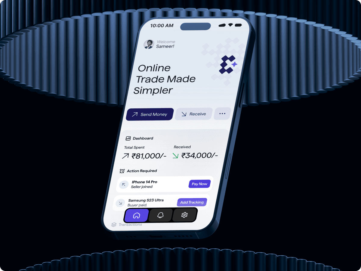
The home screen leads with the stats a seller checks daily. Any transaction waiting on you appears as a card with its single next action, Pay Now or Add Tracking.
Action Required: No important task notification lost in updates screen, the next on any transaction is directly shown on the home screen.
KYC and payouts are not settings
Settings puts KYC Verification, Manage Payouts, Bank Accounts and Saved Addresses at the top level rather than nested. In a money app it is better to keep them on the main screen to reach with a single click then nesting it somewhere.
Options like KYC Verification, Bank Accounts or Payouts are used less frequently by any Seller so it is better to keep in settings then make another Seller Settings screen.
Where it stands
Escurify has just launched. We started in March 2026, the MVP is designed and the development has just completed, and the landing page is the next thing on the block.
Transaction numbers, sellers onboarded will go here once they exist.
What could have been better
The protection fee is mandatory, and it should not be. Letting the buyer choose between bare escrow and paid cover would turn it from a toll into a priceable decision the business could actually test.
The order details screen is cluttered. It carries state, tracker, actions, agreement and contact all at once, which satisfies the lifecycle but asks too much of one view. Progress and paperwork should have been separated.
What I learned
Copy is the most valuable thing when it comes to a trust building product like finance apps or any website. Changing Pay Now to Secure Money cost nothing and carried more of the value proposition than any visual decision I made on this project.
Designing for two opposed anxieties came as a constraint. Every screen should reflect that the user's money is safe and Seller will get paid at the same moment, in the same words.
The screens where the design works are the ones where both parties come away feeling the app is on their side, which is a strange thing to optimize for and the most useful lesson here.