My role
I owned this project end to end as a freelance designer and de facto PM: research, information architecture, wireframes, high fidelity design, payment integration, and the Next.js and MongoDB bonus portal, which I built myself.
To hit a three week deadline I delegated two scoped pieces: UX copywriting, sourced through LinkedIn, and Webflow development of the page, which I can build but handed off to save time.
Introduction
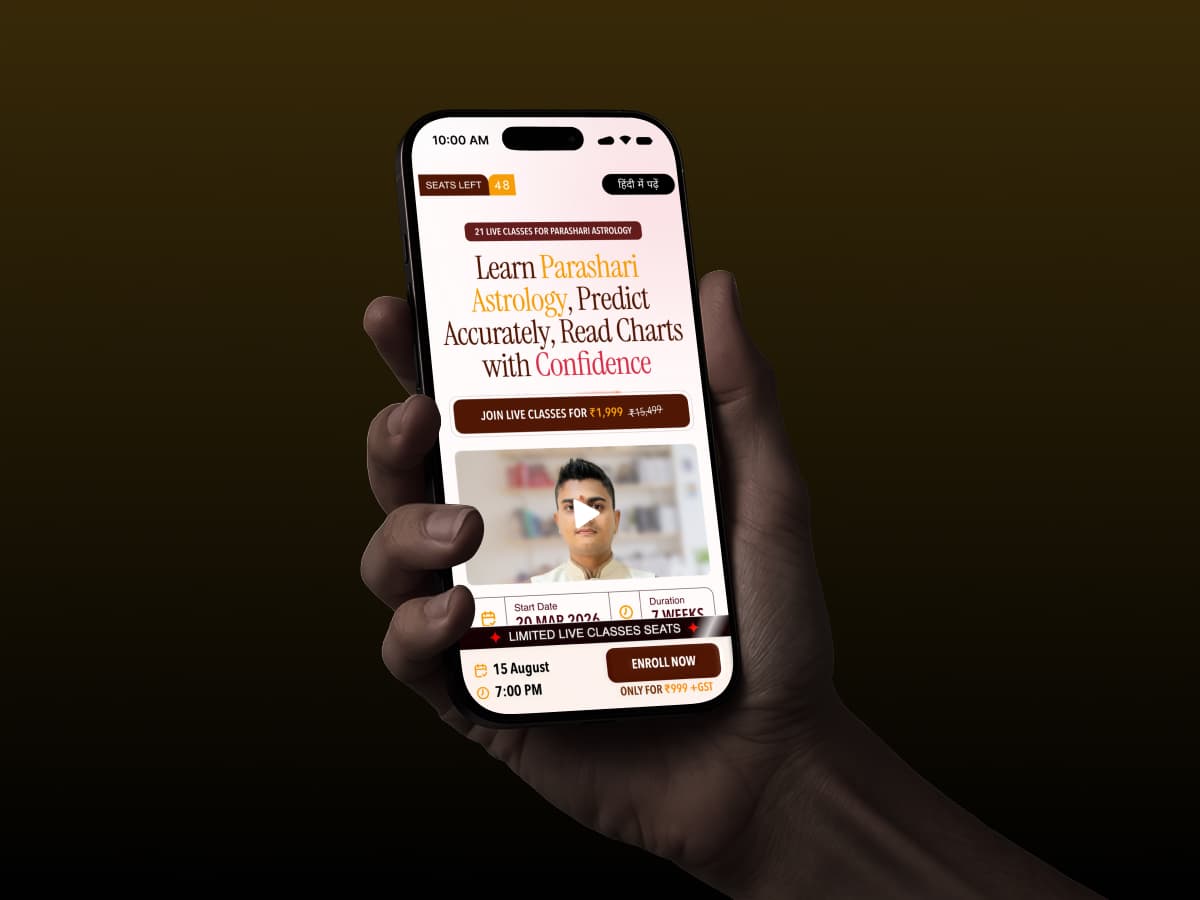
AstroAnsh sells a live, structured Parashari astrology course to learners across India: a 22-class, 7-week program priced at ₹999, taught by astrologer Saiansh Arya and sold through a single landing page backed by a WhatsApp community.
The old page listed everything and converted little. Paid traffic was expensive, checkout leaked buyers, and the brand asked me to rebuild the funnel in three weeks.
Problem statement
AstroAnsh's old landing page listed everything and ranked nothing. Visitors couldn't quickly tell what the course was or what they'd walk away able to do, so they left. Around 15% of buyers dropped during checkout from technical faults and a page-to-payment mismatch, and paid traffic converted at roughly 6%.
Solution
I rebuilt the page around what research said this audience reads first: outcomes and the exact 22-class syllabus, backed by engineered urgency and proof. Instead of treating the page as the product, I designed one system: page, payment layer, and a portal that delivers every promise right after purchase.
Research
The survey that reframed the brief
I treated conversion as a research problem first: why does an audience that clearly wants this course leave? A Google Form survey brought back 120+ responses.
The answers reframed the brief. 70% came from science backgrounds, half had already bought an astrology course, and the dominant fear was being scammed again.
90% would pay ₹2,000 or more; 73% learn on mobile. This was a trust problem, not a polish problem, and every later decision answered to that insight set.
Three personas, one shared fear
Interviews and survey data resolved into three personas, each entering astrology from a different place but deciding on the same page.
Different goals, same defining trait: all three lean logical, weigh testimonials heavily, and carry the memory of courses that overpromised. Half had paid for one before and felt cheated. The personas became the page's test: every section had to answer at least one of them, or it got cut.
Wireframes
Grayscale first, in Miro
After the final copy came to me, I sketched the whole page in Miro before opening Figma. Working in grayscale forced the reading order to stand on structure alone, with no colour or type to lean on.
It also made the cuts cheap. The long bios and filler blocks survey users said they skip died at this stage, before any visual investment could make them feel precious. This was sent to the client for approval.
User journey
Before visuals, I mapped the buyer journey as a flow: load, video, popup, checkout, thank-you handoff, every user action wired to a page, backend call, or third party.
The exits got designed too. A failed payment triggers retry notifications over WhatsApp and email, giving the buyers who once vanished at checkout a path back.
The map also surfaced open questions early, like where the report form should live, so unresolved decisions got discussed before build, not discovered during it.
Design Sheet
Just before the design skills era, with the direction settled, I compressed the system onto a single cheat sheet: type scale, palette, spacing, and recurring components, so every later section drew from the same set.
It doubled as the handoff artifact. The Webflow developer built from this sheet and the high fidelity file, which kept a delegated build visually consistent without my review on every screen.
The Landing Page
Six decisions shaped the entry point. The facts a buyer checks before trusting anything, start date, class count, timings, and language, sit pinned at the top and bottom instead of buried in FAQ answers.
A video sales letter autoplays muted, so the mentor is talking before a skeptic can bounce. A seats-left counter keeps the batch visibly finite. Hindi support got a dedicated page rather than a toggle, and the enroll CTA follows the scroll, so the decision never requires scrolling back.
Price does double duty. ₹999 +GST sits against the ₹19,999 anchor, clearing the burned-before objection the research surfaced.
The free reports popup
Ten seconds into the page, a timed popup offers two 10-year Vedic reports, worth ₹6,000, free with the course. A sample PDF sits one tap away, so the offer is inspectable.
The sample is the point. A burned-before buyer can inspect exactly what they will receive before paying a rupee, which turns a promotional giveaway into verifiable proof that the course delivers.
Iterations
The first visual direction was playful, matching AstroAnsh's brand identity. Early feedback called it irrelevant to the subject: it read like an app promo selling modern software, not a decade of ancient knowledge.
I rebuilt the theme around Indian Vedic visual conventions: serious, ancient-looking type and a warm, brownish palette. Jakob's Law again, applied to trust: this audience takes astrology seriously when it looks the part.
Diverging from the parent brand was deliberate. Category familiarity beat brand consistency for a one-page purchase decision, and the days lost to the first direction bought that certainty for every later screen.
The Course Syllabus
The syllabus is the page's trust engine, not an appendix. All seven modules are laid out class by class, each ending with a plain-language result: judge planets clearly, time events accurately, give marriage verdicts.
Results replace mystique. A science-leaning audience wants to know what skill each module installs, so every module answers that directly.
Depth is deliberate too. Topics most courses skip or sell separately, Ashtakvarga, Prashna Jyotish, Shodashvarga Talika, sit inside this one as bonus modules, widening the value gap without touching the price.
Below it sits the strongest proof: a dated, class-by-class calendar.
Monthly Schedule Dialog
"View Monthly Schedule" opens a closable dialog holding all seven weeks: every class dated, timed, and mapped to its exact topics, running through the final practice session on 30 September.
A fake course cannot publish this. Committing to 22 specific evenings in advance was the cheapest, most concrete scam-fear antidote on the page, and it cost zero scroll until requested.
Social Proofs
Testimonials went in twice, deliberately. High in the page, six video testimonials let real students say what a skeptic won't take from copy: concepts explained properly, no prior knowledge needed, confidence gained.
Video carries the burden text can't. Faces and voices are hard to fake, and this audience's dominant fear was fake astrologers.
Then, deep in the page where doubt resurfaces, a second section loops written reviews from the 200+ five-star pool. Different format, same job: whenever hesitation returns, a peer answers it.
Placement follows the reading order: video proof right after the syllabus, written proof before the mentor's story asks for belief.
Impactful Outcomes
Research said outcomes had to be impactful enough that a visitor pictures themselves after the course. Listing skills wasn't going to do that.
One avatar, four after situations, generated with AI and art-directed for consistency: reading a chart confidently, sorting career and investment moves, filtering chart noise, earning from paid consultations.
The same character across all four keeps the imagination coherent. A visitor tracks one person's transformation instead of decoding four unrelated stock scenes.
The fourth outcome, earning, is the quiet close. Research showed most buyers privately hope to earn from astrology, so the page says it plainly where they can see it.
The bonus stack, priced
After the mentor's story, the page stacks what enrollment actually includes: 100+ audiobooks, two 10-year reports, PDF notes, module tests, and a certificate, each one tagged with its standalone worth.
One bonus is sampled, not claimed. The first audiobook plays free on the page, so the stack's ₹29,500 of stated value starts with something a visitor can verify in ten seconds.
After Payment Scene
The page promises audiobooks, reports, class links, and a community the moment you pay. The old funnel broke exactly there, so I built the delivery system myself using Claude Code: a Next.js and MongoDB portal.
After Cashfree confirms payment, the buyer lands in a dashboard holding everything promised: WhatsApp community access, the audiobook library, Zoom class links, and a generator that produces their two 10-year reports from birth details.
Payment verification is integrated directly, matched to the phone number used to pay. There are a limited set of customers for this course (around 1000 each month) so verifying with OTP didn't make sense.
Conversion and retention stopped being separate problems. The page sells a promise; the portal proves it within minutes, while buyer attention is highest.
Impact
Let's Talk Impact
Measured inside the campaign, the acquisition cost fell from ₹701, the CPA of the old landing page, to ₹611, while clicks on the enroll CTA climbed 14.6%.
Improvisation
What I learned
The biggest lesson: a landing page's job doesn't end at payment. Treating page, checkout, and delivery as one system is what moved the numbers, not any single section.
Research earns its cost by reframing. I expected a polish problem and found a trust problem; that reframe decided the hierarchy, the proof, and the theme.
And delegation is a design decision. Handing off copy and the Webflow build, work I could do, is the only reason the rest shipped on time.