My role
This is the story of how I designed and built AstroAnsh v2, a platform where astrology students can buy courses, attend live classes, use astrology calculators, and learn from each other in a moderated community. I handled everything from user research and product design to the final shipped product.
Introduction
AstroAnsh is an astrology education business run by my client, who teaches live courses to aspirants mostly in the 40 to 50 age group. This age group was the biggest design constraint of the whole project. Whatever we build, a 45 year old user who is not very comfortable with apps should be able to find their class, their notes, and their tools without getting lost.
There was already a version 1 of the app, which I had built earlier. That version served recorded video lectures, and honestly, the design was confusing. Now the use case had also changed. The client moved to live courses, so we needed a new app built around live classes, not a video library.
Problem statement
The business ran on manual effort and scattered tools. Students had no single place for their course, notes and recordings, every user was registered by hand, and the paid WhatsApp community had turned into a place where other coaches sold their own courses to the client's students.
Solution
One platform where students buy a course, attend live classes, and access everything from a single course page that works like a dashboard. Plans handle access and expiry automatically, and a moderated in-app community replaced WhatsApp, with automated checks so nobody can advertise to the client's students.
Research
Understanding the Pain Points
I talked to 100+ students who were already enrolled in the client's course and were using the v1 app for daily practice. The goal was simple, understand what problems they faced in the current app so the new version fixes real issues, not assumed ones.
From these conversations I built a user persona and an empathy map. The empathy map helped me see the gaps in what I knew about the users, and mapping their attitudes kept the design decisions grounded in how a 40+ non-technical user actually behaves.
Ideate
Converting the research into decisions
Before designing screens, I mapped out how a user moves through the app, from landing on a course page and paying, to signing up, reaching their course dashboard, and using classes, resources, calculators and the community from there.
This helped me spot where a 40+ user could get lost and keep the path to every feature short.
Key decisions
After brainstorming and talking to users, these were the ideas I moved forward with:
A Resources section inside each course page where the client can upload recordings, notes and tests, so students find everything in one place.
The next class link shown right on top of the course page with a timer, because joining the next class is the most frequent action a student takes.
Three pricing tiers per course, so users can start within their budget and upgrade later.
A Relate button in the community, so a user gets notified when someone else's similar question is answered, without having to ask it again themselves.
All astrology calculators embedded inside the course page itself, not hidden somewhere else in the app. The course page is the student's whole dashboard.
Brand Identity
The playful visual direction came from the client's own class PPTs. Students spent hours with those slides every week, so I matched the app to that same feel — what they see in class matches what they see in the app, and it instantly feels familiar.
Sen's rounded letterforms carry that friendly tone for headings, with Helvetica keeping body text easy to read.
Onboarding
Onboarding works in three ways:
Enrolment form. A form for previous community members who are scattered in google sheets / previous app etc.
Referral link. A user purchases a course through a referral link and signs up after checkout.
Direct signup. A user visits the app and signs up from the signup page.
Enrolment Form to claim bought Courses
This one solved the migration problem. Existing community members had already paid via Cashfree, so I designed a form that matches the user's phone number against the Cashfree database, verifies it with OTP, and enrolls them into the exact course they had paid for.
The same form was used to migrate users from the old app to the new one, without any manual work.
See how I solved the problem
Multiple Plans
Each course has three plans: Basic, Pro and Pro+. This was a deliberate decision because the client was already selling three variants of the same course, just informally. Now each plan clearly defines what the user gets.
For example, a Pro plan gives access to live classes, 180 days of recording access, 90 kundali analyses, 40 ten-year reports and 4 months of community access.
If a user wants to upgrade, they only pay the difference between the two plans. This removed the friction of "I already paid once, why should I pay full price again."
Course Page
The course page is the heart of the app. It is split into tabs, and each tab shows different content depending on the user's plan.
Classes tab: Upcoming class schedule and updates. Pro users see their special classes here.
Resources tab: PDF notes, recordings, and for Pro members, the option to schedule a consultation with the mentor.
Calculators tab: All astrology calculators with limits based on the plan.
Community tab: Direct access to the community for plans that include it.
The thinking here was simple. For a 10,000+ user, the fewer places they have to look, the better. So instead of spreading features across the app, everything a student needs lives inside their course page. It works as a dashboard, not a schedule.
Community
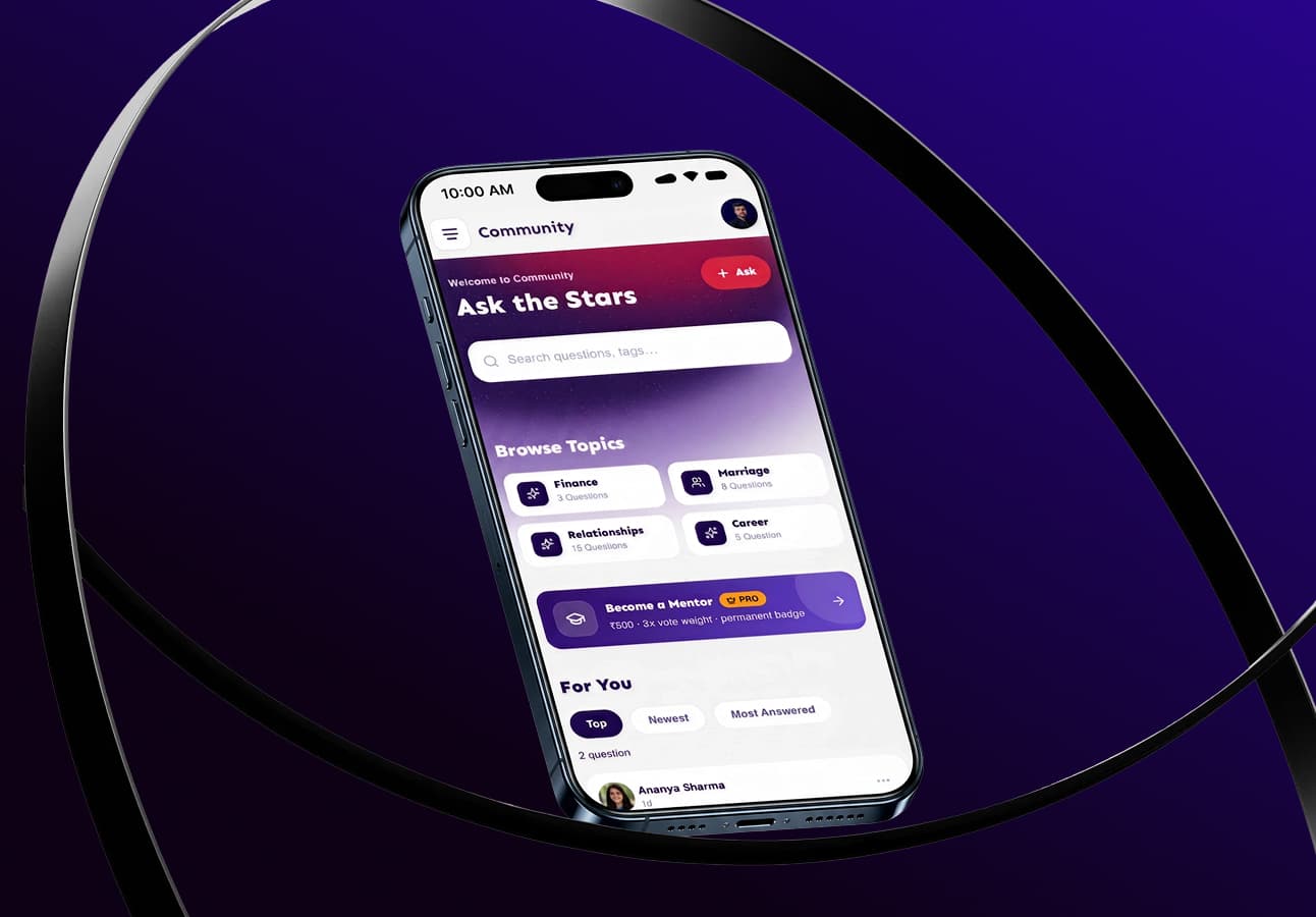
The community is the most important feature of the app because it is what replaced the WhatsApp group, and it connects students, mentors and the client in one place. Topics work like channels in Discord. Questions get organised by topic, so a user can open a topic and learn just by reading the answers there.
Relate is this community's version of upvoting, and it exists because of something specific I learned from users. Astrology questions are often about personal matters, and users hesitate to ask them publicly.
If they see a similar question already asked, they can tap Relate. The question gets attached to their notifications, and when anyone answers it, they get notified. They get their answer without exposing anything personal.
Ask with Horoscope Upload
This is not a generic forum post composer. It is designed for astrology specifically. A user can attach a horoscope with their question, either as an image or by entering the birth details along with the question, so mentors have the chart in front of them while answering.
Mentors and Top Contributors
Answers from mentors carry more weight. To become a mentor, a user applies, and the application shows up on the Mentor Dashboard for approval.
There is also a Top Contributor title for active members. A cron job checks how many questions a user has answered, and since the community is still small, the bar is set at answering 30 to 60 percent of all questions posted. Around 30 to 40 questions are asked every week as of now, so the title stays meaningful and hard to farm.
Report, Suspend, and keeping the community ad-free
Report and Suspend work the usual way, but the real protection is automated. The system detects phone numbers in posts, and an AI check on the backend scans images before they are uploaded.
This exists specifically because of what happened in the WhatsApp community. People used it to advertise their own coaching, and this system makes sure that cannot happen here. A user can be suspended if other community members are frequently reporting their content.
Impact
Let's Talk Impact
Improvisation
What could have gone better
The design to dev process. We were going Figma to Claude Design to Claude Code, and this became heavy and messy. A lot of inline styling got injected into the code. What I would do differently is import the Claude designs back into Figma first, and then prompt Claude Code through the Figma MCP, so the code stays clean and tokenised.
Saved horoscopes as person objects. Right now, users fill the full form every time they generate a horoscope. Saved horoscopes should have been stored as person objects, so forms like Matchmaking could be pre-filled from them. It would save real time for users who check the same charts repeatedly.
A Topic Expert title. The community has Mentors and Top Contributors, but in astrology, people specialise. Someone might be strong specifically in nakshatras or dashas. There should be a path for users with high upvotes in a specific topic to earn a Topic Expert title for it.